

After 25 years of learning to produce prints that are durable, washfast and long lasting, the hot "look dejur" is a print that appears to have been laundered 50 times via being beaten on a rock by the side of a mountain stream. Why? Because the older and more washed out your T-shirt looks, the cooler you are. The customer is now willing to pay extra for a look that he would have refused to pay for at all not long ago.
Though some struggle with it, the distressed look is well within the technical reach of nearly any print shop, and here are a few tips, tricks and techniques that can maximize effectiveness and productivity. There are a number of specialty inks on the market that can be used to create a vintage look. Most of these products are designed to crack when stretched after drying.
One of them actually continues to “enhance the degradation,” according to promotional literature, with every wash. (I think this means that it will fall apart on an on-going basis.) The degree of degradation, and the exact method of achieving it vary by manufacturer. I find that, while all of these inks have some degree of merit, the best and most believable distressed-look results are achieved using them in conjunction with artwork that is prepared specifically for this purpose.
Creating the artwork
I like to create my art for this process in Adobe Photoshop. You will first need to either create, or procure a distressed pattern (detailed below). (See Figure 1.)
Type or image should be set in a uniform color; here I have used black for ease of selection. For most noticeable results, I would recommend using fairly bold graphics, and type. Smaller images tend to lose their ability to be recognized when visually broken by the distressed pattern. (See Figure 2.)
The portions of the image that you wish to distress should be selected using either the magic wand, or the color range selection command. (See Figure 3)
The distressed pattern should be opened in a separate document in PhotoShop, and the entire image selected using the menu item select/select all. The pattern image is then copied using menu item edit/copy.
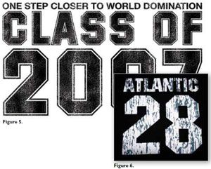
After copying the distressed pattern, return to your original type document and go to menu item edit/paste into. (See Figure 4.) This will paste the copied pattern only into the selected areas. Do not use the copy command, as this will paste the pattern over the entire document. Once you have completed these easy steps, you should have a finished design. (See Figure 5.)
There are many types of distressed patterns available. You should look around to find the one that best fits your application. As a word of caution, real distress cracks run vertically, top to bottom. I have seen a number of commercially available prints where the cracks run horizontally. Plastisol stress cracks always form along the knit of the garment. Thus, horizontal cracks are a dead giveaway that you really are not wearing dad’s old shirt from 1977. (If this fact were to come to light, the wearer could be severely ostracized and banned from hanging with the cool kids.)
Screen preparation
The preparation of the printing screen is as it would be for any other basic design. For our example, I used a 110 mesh coated with a photopolymer emulsion, and exposed for 45 seconds on a fluorescent exposure table. One of the great things about printing distressed looks is that even if you lose a little detail, no one will know.
If you are printing white ink and desire that hard, printed-enamel look of the 1960s, I would consider using a thickilm HD stencil. I have had the best luck using an 80-tpi mesh with a 200-micron stencil. A vintage type plastisol can be utilized to give the hard hand.


Set-up and printing
Screens should be clamped into the press and adjusted with just enough off-contact to allow the image to peel away from the garment approximately one inch after the squeegee passes. This will leave the cracked image with crisp, sharp edges.
Basically, any plastisol will give the desired effect. I like to add a small amount of dulling agent to accentuate the vintage look and feel. For a more realistic look, a special vintage or distressed ink can be used in conjunction with the patterned artwork.
In some instances, I may create a two-screen, one-color design using a “stain” print to simulate the area where the ink would have been degraded over the years. (See Figure 6.)
The stain was created using the same paste-into technique detailed above, using a 15 percent dither pattern rather than the distressed pattern. The stain prints under the entire pattern, using a 150 to 200 mesh and a thinned-down version of the same color.
The actual printing is straightforward. Squeegees should have medium—say, 70-durometer—sharp blades. Print using a normal printing angle (see Figure 7), and voila! Faster than you can say Rumpelstiltskin . . . you have a beautiful (?) shirt that looks just like you inherited it from Dad’s college wardrobe.

Reprinted from Printwear Magazine August 2007 ©2007 National Business Media, Inc. All rights reserved.